Finished Construction of Front Cover, Contents page and Double page spread for my music magazine...
FRONT COVER:

CONTENTS PAGE:

DOUBLE PAGE SPREAD:
Front Cover Construction:
I began by cropping my Title of 'Ardor' out after saving it and getting it from DaFont.com. I then put it onto a white background and added minimal text of the predominant cover-line and the barcode.

I then created a small cover-line that would feature on the right side of the front cover and be a part of the image, it would act as a lure and I made it bold to stand out, also following the house colours of 'Ardor' magazine, being red, blue, black and white. I kept it all black and white and enhance particular words with red and blue to stand out, also to maintain the 'Ardor' Hip-Hop music magazine identity.

I then uploaded my chosen image that I took of two models. Their clothing choice was intended and chosen by me in order to fit the Hip-Hop style, this included snapback caps and hoodies, and to also relate to their story of two boys from London fresh out of school who are discovering the world, this inspired me to model them wearing rucksacks as well as rucksacks adding an urban feel to the image.


I cropped out the top of the image and put it at the top of the front cover as the original image didn't cover the whole page, this then filled the entire page and there was no blank space. I also added some cover lines in and a strapline at the top above the title of 'Ardor'.

Draft 2+Final draft.

I added a headline to my main image to sum it up and stretched it across but I didn't think it stood out as every colour seemed to clash against the background and I didn't want to not use colours that broke my house colour identity, I then added a stretched banner across my image and put it as red and blue, my house colours.

That is what the finished product looked like:

For my final I re-evaluated and decided to take the huge, obtrusive red banner away as I felt it dominated too much and didn't fit with my intended style, I then opted for a thin, smaller black banner to cover a half of the image and then to fill the black banner with the white writing and that acted as my headline and main cover-line feature. I feel this looked more Hip-Hop and mature and less obtrusive and immature. This is my final draft of my Front cover, after two drafts and many experiments on photoshop. I felt the large red banner was obtrusive and didn't fit my mature, chilled, Hip-Hop/Rap style and so I opted for a subtle diagonal slim black banner with white writing that didn't take up too much space of dominate the image, instead it compliments it as well as sticking to the Hip-Hop/Rap style. I felt the cover-lines looked a bit weak and therefore added some more with larger font and more words were highlighted in the colours of my house colour scheme. I also shifted the Masthead and top-banner over to the left and in the top right hand corner added a cd with a small cover line with the same format as the main headline with the words 'win a signed Yeezus album...' this competition and prize prospect acts as a lure...

Contents Page Construction:
Draft 1.

I added each image and put a coloured box behind it. The colours related to the story and subject, for example the main image had the red and blue boxes behind it; the house colours. This showed the significance of the picture as well as it being the largest image and at the top of the page.

This shows the addition of each image an the box behind each image. I put a purple box behind the only female subject the differentiate between the genders, but as I explained in my pitch I wanted to break the gender divide and pre-conceptions of gender so I gave the only female subject a black background box like every other image to achieve equality and challenge the stereotype.

After initial evaluation I felt that this contents page and colour scheme and format looked too immature and the background colours looked more relevant to a pop magazine with a younger demographic, that inspired me to scrap that unorganised and colourful plan and go with a more straight forward, mature and male oriented contents page with just black boxes behind each image.
Draft 2+Final draft.

The main image takes centre stage at the top with the largest cover-line and image number. I originally intended to include more photos but there was not enough room on the page as the shapes of the photos were odd and therefore I cut it down.

I added in a subscription with a money off token, this is relevant to my target audience as they would have less disposable income. I feel this contents page is much better than the first draft because its more mature, follows more of a Hip-Hop and Rap style and would appeal more to my target audience and demographic whereas before it lacked any real shape that was typical of a contents page and it looked more colourful and unorganised and would have suited more a pop magazine, so that's why I dimmed the colours down and only used house colours; red, blue, black and white with some yellow on the black subscription to stand out.

This my final draft of my Contents page, after two drafts and experimenting with a range of photos. I added various features and got rid of the red arrow and replaced it with a twitter and facebook sign and address, this relates to my target audience as they would all be online and it would widen my business prospects and connect more to the audience.

Double Page Spread Construction:Draft 1.
Initially I created a similar design with regards to image placing, quotes, headline and strapline. However, after receiving some feedback from classmates it became evident that I need to cut down on the density of my article and make it smaller and cut the word count so it doesn't just dominate the page and look like an extract from a long novel as it wouldn't appeal to my target audience and demographic so therefore I cut the word count down and I included pull-quotes and more colours to make it look less intimidating and more of an article than an extract from a book.


This is some notes of feedback I got back from peers when looking at this initial draft of my double page spread. This inspired further alterations and editing to be done.

Draft 2.
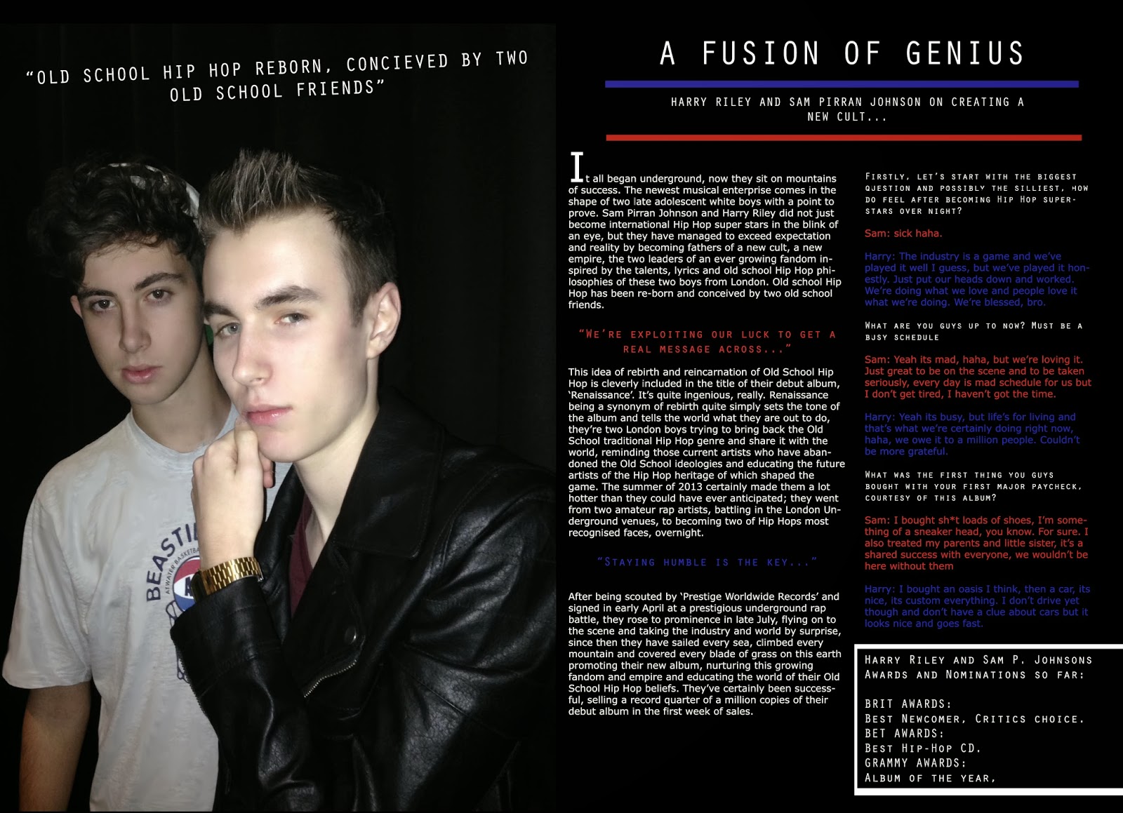
This is the image that I chose to use, again the models are wearing clothes typical of the Hip-Hop scene and it is made clear that he is wearing a gold watch, again a symbol relative to the Hip-Hop and Rap genre. I added this image to a black background and included direct address of the image to connect them to the reader.

This is my final draft of my Double Page spread, after two drafts and some further experiments after receiving constructive feedback from peers.

Example Of Photoshop:
These images show a simple process of skin healing in order to make my models as presentable as possible as well as enhancing my magazine identity and displaying my Photoshop skills in order to produce a professional looking final product.
This first image shows the original photo and the uploading of it to Photoshop in preparation for my double page spread (I later decided not to use this photo and opted for an image with direct address instead).

This shows the tools I used in order to achieve the smoother, healed effect on the models skin and rid him of scars and blemishes.

This shows the final result in comparison with the original photo and the difference the tools and Photoshop made to my final product. I used this tool on all of my pictures including the front cover, contents page and double page spread, it gave the models clearer skin and gave the magazine a more professional look.

No comments:
Post a Comment